Tools to play with - Quick reference
Vintage.com
We help people unlock the hidden value sitting in their homes, one box at a time.
We help people unlock the hidden value sitting in their homes, one box at a time.
This is a short, comprehensive overview of the Vintage.com brand guidelines. It covers the essentials: our identity, logo usage, colour palette, typography, tone of voice and visual language. For the full, detailed guidelines, refer to the extensive brand guidelines document.
We help people unlock the hidden value sitting in their homes, one box at a time.
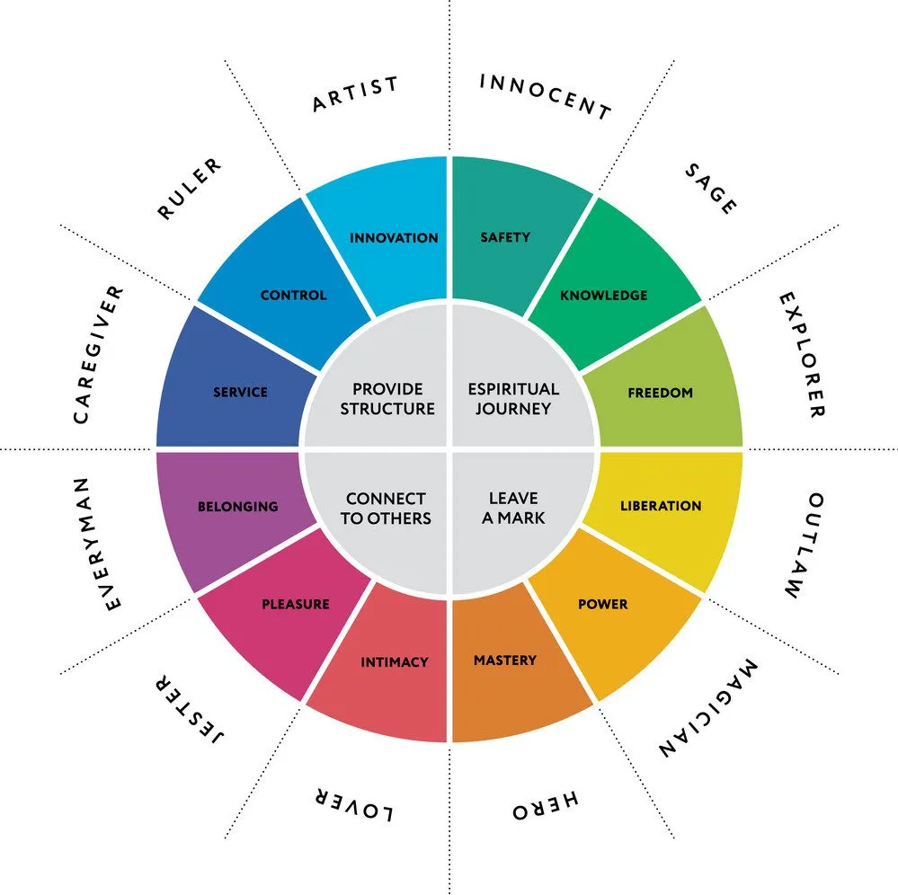
Brand archetypes give a brand a consistent human personality that people instinctively recognise and trust. We use the Magician because it mirrors what we actually do: we see value where others see clutter, and we transform forgotten items into something rewarding.
Confident, not showy. Knowledgeable, never patronising.
Learn more about the Magician archetype: The Magician Archetype in Branding (ebaqdesign.com)
The Vintage.com logo consists of two elements: the key-in-box mark and the VINTAGE.COM wordmark. Always include the ® symbol with the combined logo, the key mark on its own and the key as a decorative element. The wordmark and key mark must always stay in their original proportions to each other.
Maintain clear space around the logo equal to the height of the key mark on all sides. Nothing should intrude into this zone.


The key can be extracted from the box and used as a standalone illustrative and decorative element, in both landscape and portrait orientation. Always use ® to show it's trademarked.

A cropped version of the key is used as the app icon and favicon. Designed for small-space recognition: favicon, homescreen app icon, clothing tags, labels. Use any brand colour or shade.
Seven brand colours across three families: Salmon, Lila and Royal Blue.
The brand uses a 40/40/20 ratio: 40% Salmon, 40% Lila, 20% Royal Blue. Never exceed 20% blue.
Evaluate colour balance at three levels: the brand as a whole, the individual touchpoint, and the single composition. A blue page inside a multi-page brochure is fine because the brochure overall stays balanced. A blue newspaper ad is not, because that ad is the entire touchpoint. One blue screen in a bumper with multiple screens works. A standalone blue end card does not. Royal Blue should never dominate the overall impression at any level.
Colour combinations: See the separate Vintage.com Colour Combinations Reference document for the full set of 21 approved combinations (three-colour, two-colour and monotone).
Vintage uses a single typeface for everything. One font keeps the brand simple, recognisable and easy to work with. The chosen typeface is nearly a century old, yet it fits right into today's geometric type trend. Its classic details, like the diamond-shaped dot and elegant ligatures, give it a distinctive character that sets Vintage apart.
Strong visual hierarchy is essential. Use size, weight and spacing to guide the reader, not decorative styling. Avoid falling into a pattern of italic, underline or bold every few lines. If everything is emphasised, nothing stands out.
P22 Underground is based on the original London Underground typeface and supports Latin, Cyrillic and Greek alphabets. When designing, take advantage of its subtle ligatures to add an extra layer of sophistication to headlines and display text.
Adobe Fonts: fonts.adobe.com/fonts/p22-underground
Use four weight variations: Light, Book, Medium and Demibold. Always use optical kerning.
We're welcoming and familiar, not formal. Our words are like a conversation with a friend.
We're practical and straightforward, not confusing or unclear. Our words are direct and helpful.
We're easy to work with but not immature or jokey. Our words make people feel relaxed.
If Friendly is our heart and Pragmatic is our hands, Easy-going is our posture. It's how we carry ourselves in the room. It ensures our friendliness does not feel soft and our pragmatism does not feel mechanical.
And when we get it right, our audience smiles and trusts us.
We're a knowledgeable and trusted friend who you can rely on. Someone who actually follows through with what they promise.
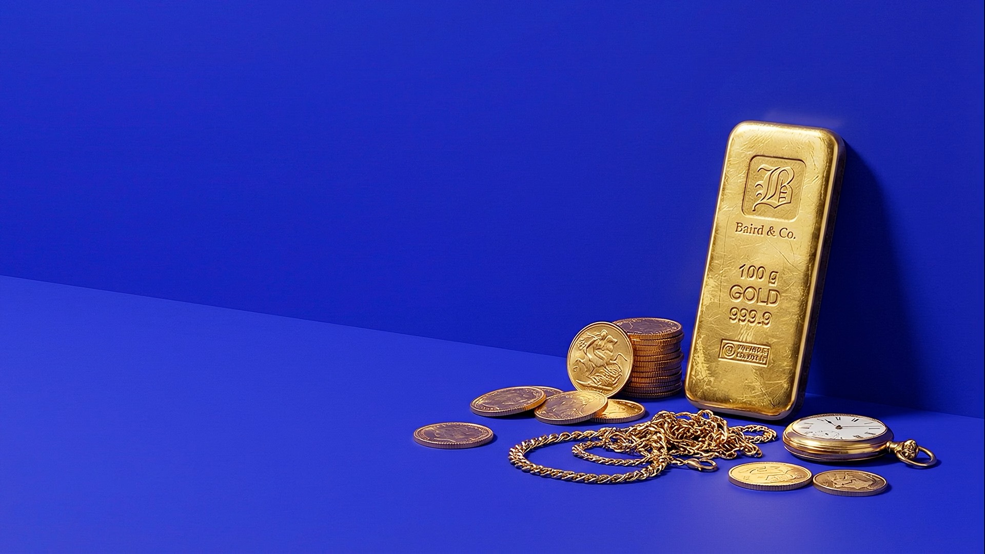
Every item has value. There is no such thing as trash. Our photography reflects that belief by presenting products in high-quality shoots with carefully considered lighting and a touch of drama. When people see our imagery, they should feel that these items deserve attention and a second life.
We use products we receive and create them on brand with a software tool called Studiographer. The tool allows different colours, angles and compositions with a variety of lighting drama, so you can create on brand imagery fit for your specific touchpoint.
Studiographer: studiographer.edbloom.nl
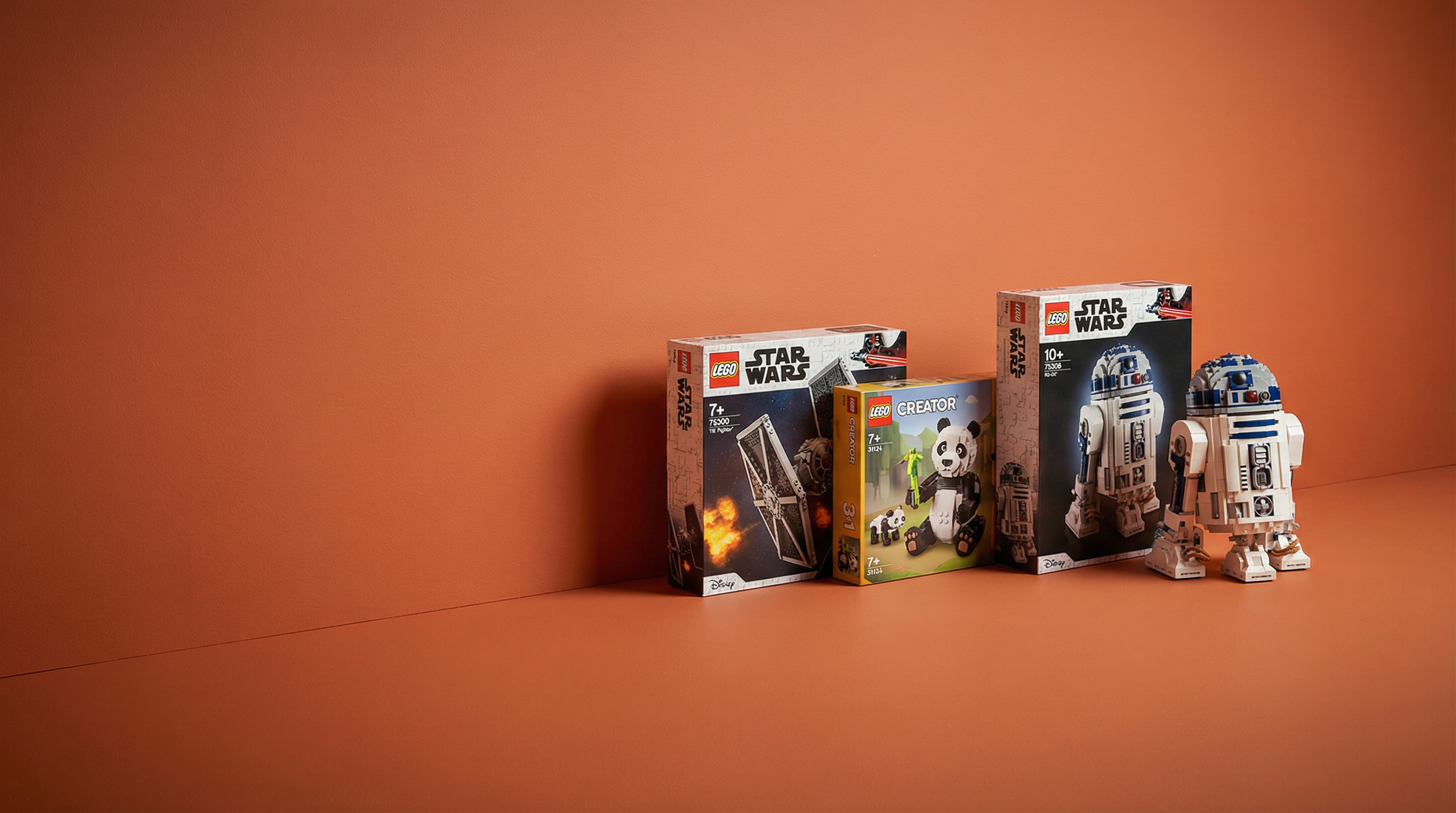
Based on one item category. Nicely used in communication where more abstract topics are addressed. Think: "Vintage.com is good for the globe!" showing a vintage globe in brand photography. Or "Contact us" with a vintage phone.
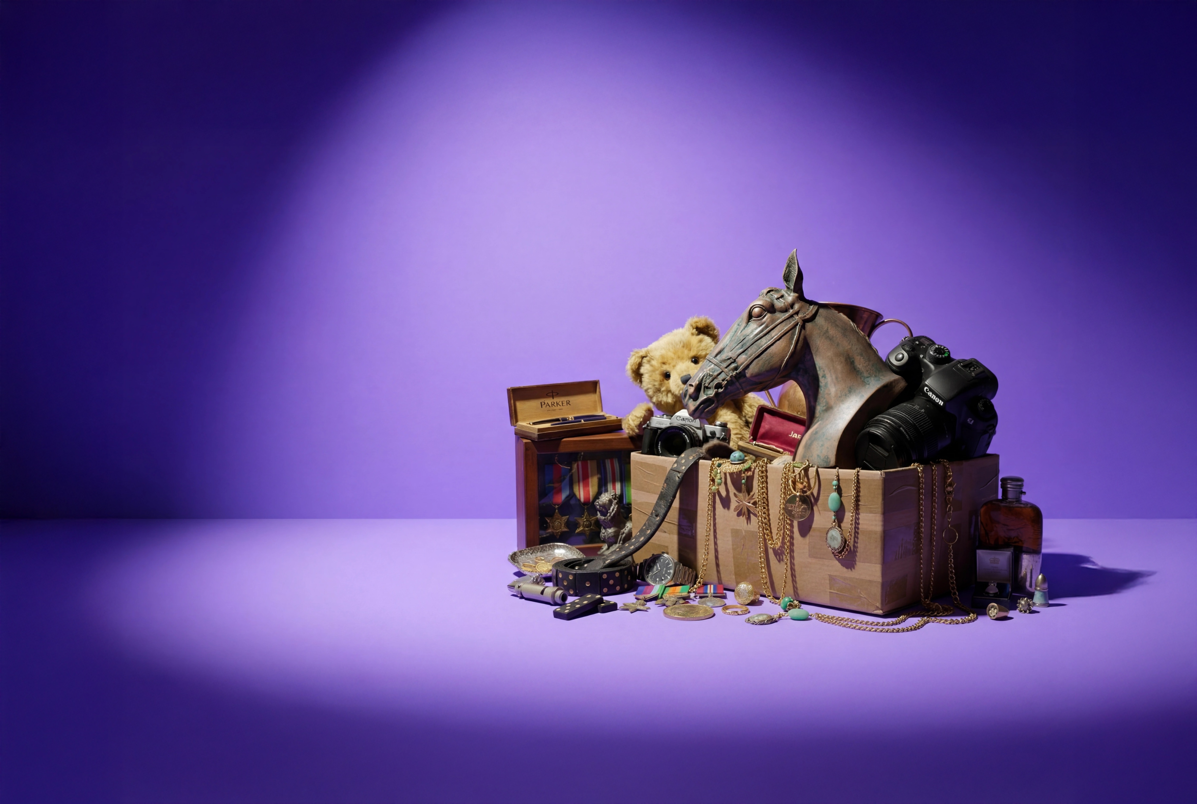
Based on a mix of items, and often used to nudge the process of sending and explaining the concept.
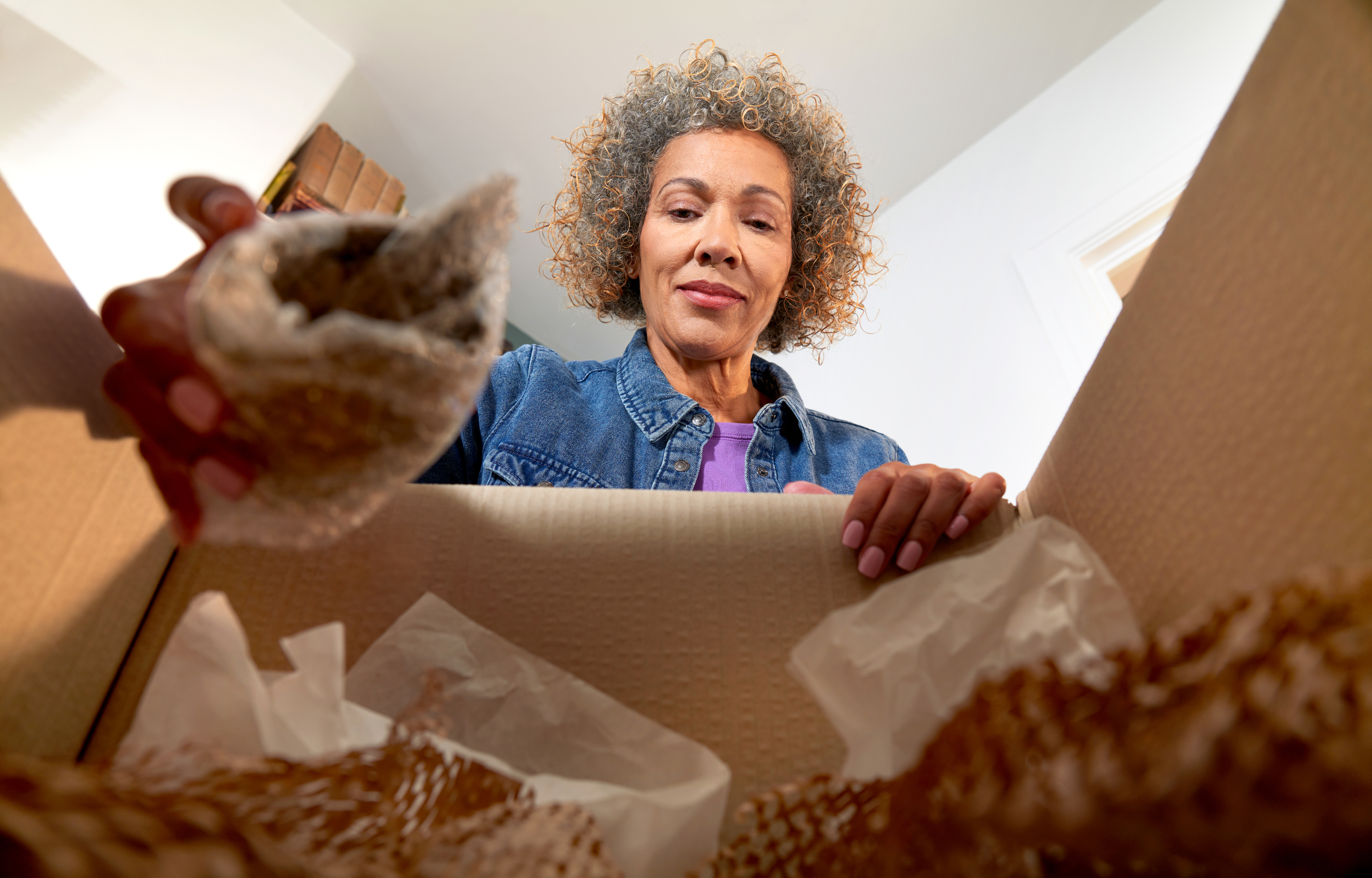
Shot by Ponderosa. It describes the process of sending in your items with two different characters.
Perfect when you need to make something on brand, without a theme or conceptual layer. Think: letter envelope, or garage door.
We try to avoid the use of icons as much as possible. The whole world uses icons everywhere due to a lack of visual elements. We have rich visual assets (photography, illustrations, colour) and should use those instead. When icons are truly needed, we use Phosphor Icons in thin lines.
Always use the Light variant from Phosphor. Avoid scaling icons too large. Icons may only appear in brand colours. Partial fills are allowed as a playful detail, as long as they do not make the overall design feel busy. Refer to the current product design style for reference.
Phosphor Icons: phosphoricons.com
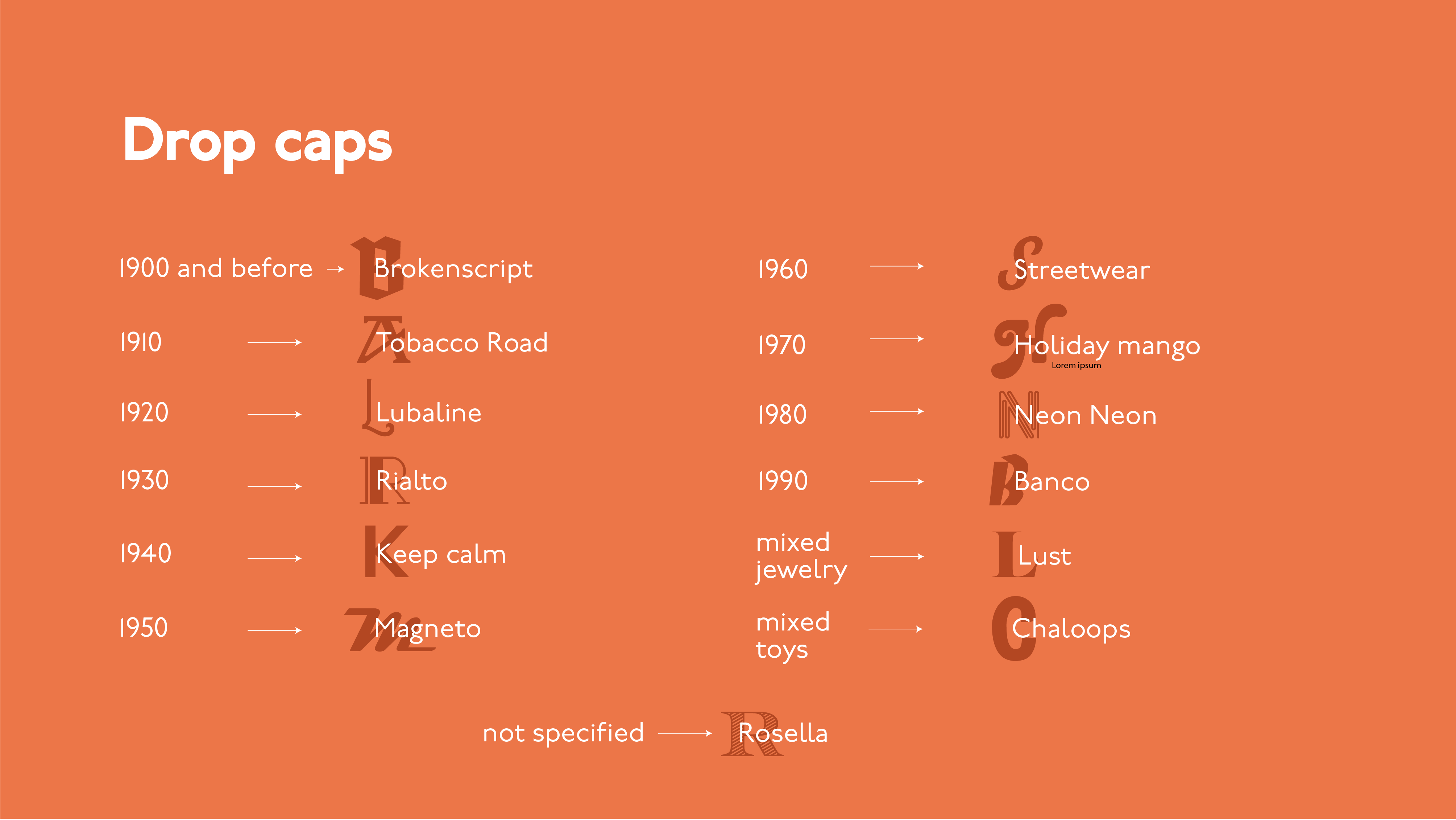
A visual text element. Explained in the extensive guidelines.